Accessibility in a digital world
According to Google, 15% of the world's population, 1 billion people worldwide, suffer from an impairment. Although the inclusion of people with disabilities is enshrined in law, the reality speaks a different language. As a result, in 2019, people around the world claimed their right to accessibility almost every hour. As a result of these lawsuits, companies lost $6.9 billion worldwide.
In addition, businesses are missing out on quite a bit of revenue. Two out of three online purchases are abandoned because people with eye impairments cannot complete their transaction (cf. Microsoft, 2021)
Fixing accessibility bugs after the fact, is 600x more expensive than designing an accessible website.
Deque University
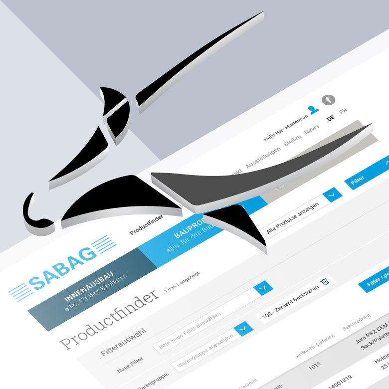
Microsoft leads by example
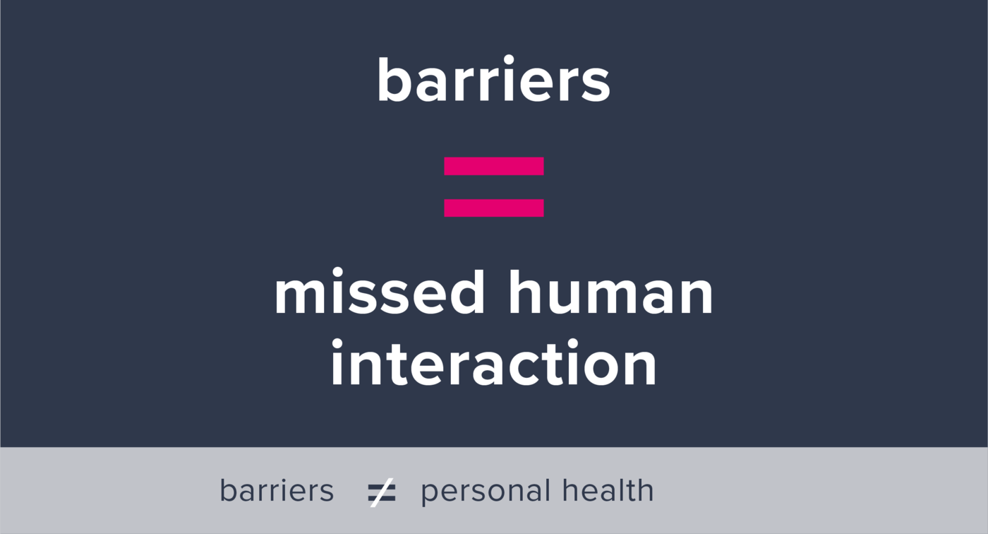
People who live with an impairment of their sensory organs or a limitation of their mental or motor skills still encounter many barriers in the digital space. We speak of digital barriers when impaired persons cannot move independently on digital media and channels and participate in digital life. Examples range from sending emails to buying tickets to shopping online.
Microsoft can be cited as a prominent showcase for barrier-free access in the digital world. Influenced by the personal experience of Microsoft's CEO, father of a son with cerebral movement disorders (Officechai, 2017), the company is making an important effort. The experts are guided by the Web Content Accessibility Guidelines (WCAG) - internationally recognized guidelines for accessibility.
UFirst Focus
The UFirst Group design team has developed expertise in web accessibility. Our focus is on the handling of colors, fonts and images for people with limitations in their vision.
Dealing with colors
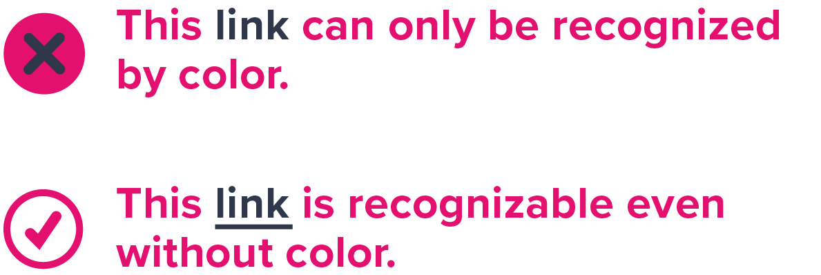
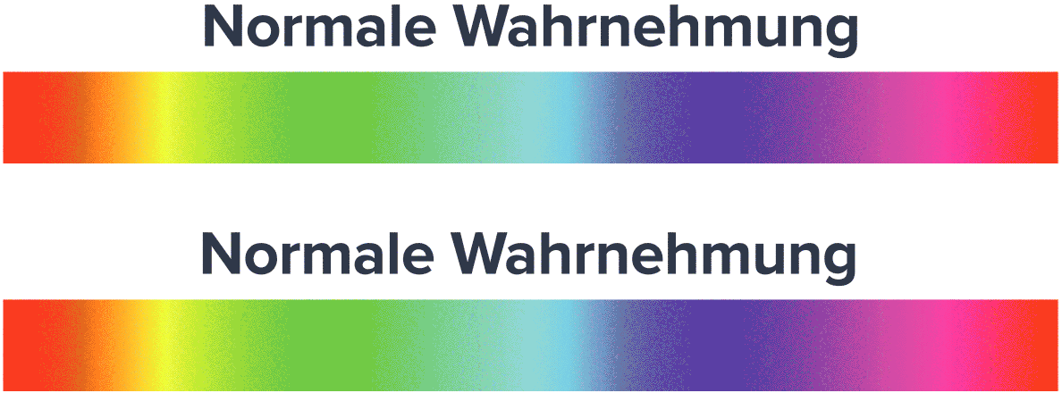
About eight percent of Europeans suffer from impaired color perception. Accordingly, it is important to eliminate color-related barriers at an early stage when designing digital applications and websites. Conversely, this does not mean that colors cannot be used. What is important is that colors have enough contrast so that they can be clearly distinguished even by the color-blind. For this purpose, we recommend a contrast check such as www.webaim.org/.
Digital interactions
Difficulties also arise with interactive elements of a website.
Making default, pressed or active states with colors can be difficult to understand. It would be better to represent these states with clear elements such as an outline.
Microtypographical elements
In our world, information and knowledge are largely passed on as text. For people with a visual impairment, however, this often presents a challenge. The design of the font as well as the arrangement of the text are match-deciding whether information can be read. The distinction between readability and legibility is defined as follows: Readability describes the recognizability, perception, and distinction of individual characters and words. This involves micro-typographical details. Readability, on the other hand, refers to the comprehensibility of coherent text, which is described as a macrotypographical feature.
Font size
The choice of font size is a trade-off between the possible amount of displayable information and readability. Experts recommend not to go below a font size of 16px. In detail, however, it depends on the font type.
Distinctiveness
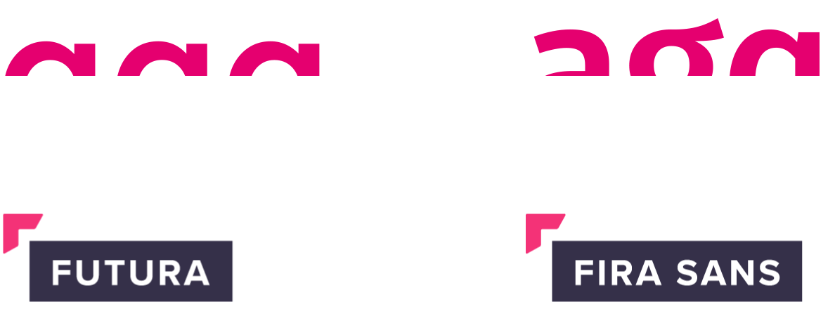
A differentiated language of forms makes it easier for the user to grasp characters more quickly.
Line thickness contrast

People who suffer from visual impairment due to cataracts are very sensitive to light. Classicist, Baroque or Renaissance fonts quickly lose their shape when exposed to too much light and become illegible for the viewer.
Macro typographic elements
To ensure that texts can be understood as easily as possible and without barriers, the following aspects must be taken into account from a typographic point of view:
Text arrangement
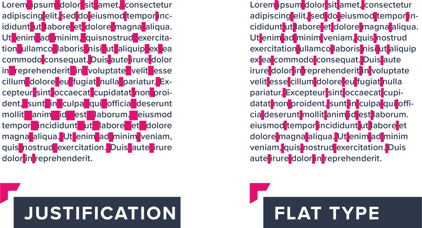
For good readability of text blocks, especially on mobile devices, it is recommended to arrange the text as flat type. The regularity of the spaces between words favors easier perception.
Line length
Long lines make it difficult to return to the beginning of the following line, while lines that are too short lead to frequent line breaks and word separations. An optimal line length for German texts is between 35 and 80 characters including spaces.
Line spacing
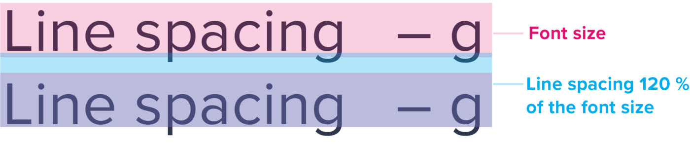
When spacing text, it is important to prevent the eye from unintentionally jumping to another line while reading. This can be a challenge, especially for people with disabilities. As a general rule, the minimum line spacing should be 120 % of the font size. In no case should characters of different lines touch each other.
Visual language

The visual language often embodies a brand to a great extent. A visual language without barriers is no contradiction to this. Because an easily recognizable and clear statement is central for both themes. Foreground and background should be easily distinguishable from each other. Blurring or brightening the background or, alternatively, cropping the subject helps people with impaired vision to perceive images.
In terms of inclusion, alt text should always be provided for people who use a screen reader, so that they can also understand the message of the image.
Icons and pictograms as part of the visual language can help to understand a text. In addition to a concise design, a two-dimensional implementation should be preferred, since this is better recognizable according to studies.